Invention, design and project management of a web app for daily trivia encouraging users to be more in tune with recent global events.
Quizzy.News
Conceptualization, UX research, UX design, wireframe, prototypes, testing, UI design, project management for build and launch
Role
Scope
Brief
This daily trivia quiz game was my response to something I had witnessed while a teacher in the classroom. Students would come into my room in the mornings and enthusiastically share misinformation learned from unvetted sources on popular social media sites. I wanted to create a fun, engaging way for them to find truth, enter: Quizzy.News. This responsive webapp gives users a quiz game of five questions about global and national news stories - all published in the last 24 hours and refreshed daily. The intention is that this encourages users to be up-to-date with current events in an accurate way. Quizzy.News’ primary target users will range in age from 10 to 110 and consist of folks who love a quick game like Wordle, and are very interested in the news.
Problem
“Less than 20 percent of U.S. teens report reading a book, magazine or newspaper daily for pleasure, while more than 80 percent say they use social media every day, according to research published by the American Psychological Association.” Quizzy.news has identified a lack of engagement with reputable news sources on behalf of teenagers, which feeds their misinformation on current events, which can negatively affect their perception of the world around them.
Goals
Design a user experience to drive more engagement with neutral, reputable news sources and help users become more aware of critical current events in a well-rounded, unbiased way.
Understanding the User
User Research Summary
I interviewed users of varying age groups and levels of news interest. Research suggested that most participants reported interest in news events and were concerned about source reliability. It was also very clear that users would be open and willing to work towards bettering news-reading habits if they had a fun, engaging way to connect with current events. The following persona is based on these interviews.


Ideation
Using Crazy 8’s to quickly ideate, I came up with some ways to address gaps identified in the competitive audit. My focus was specifically on providing accurate, of-the-moment information and creating a strong sense of engagement.
Starting the Design
Digital Wireframes
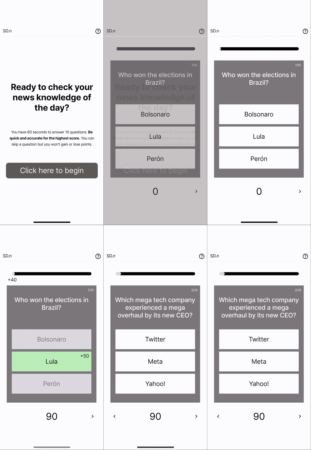
After ideating and drafting some paper wireframes, I digitized initial sketches for Quizzy.News. These designs focused on the engagement aspect of the experience so that users would enjoy the news more.
(left) Landing page creates anticipation and excitement.
(center and right) Series of timed questions keep the user engaged and invested.
Low-Fidelity Prototype
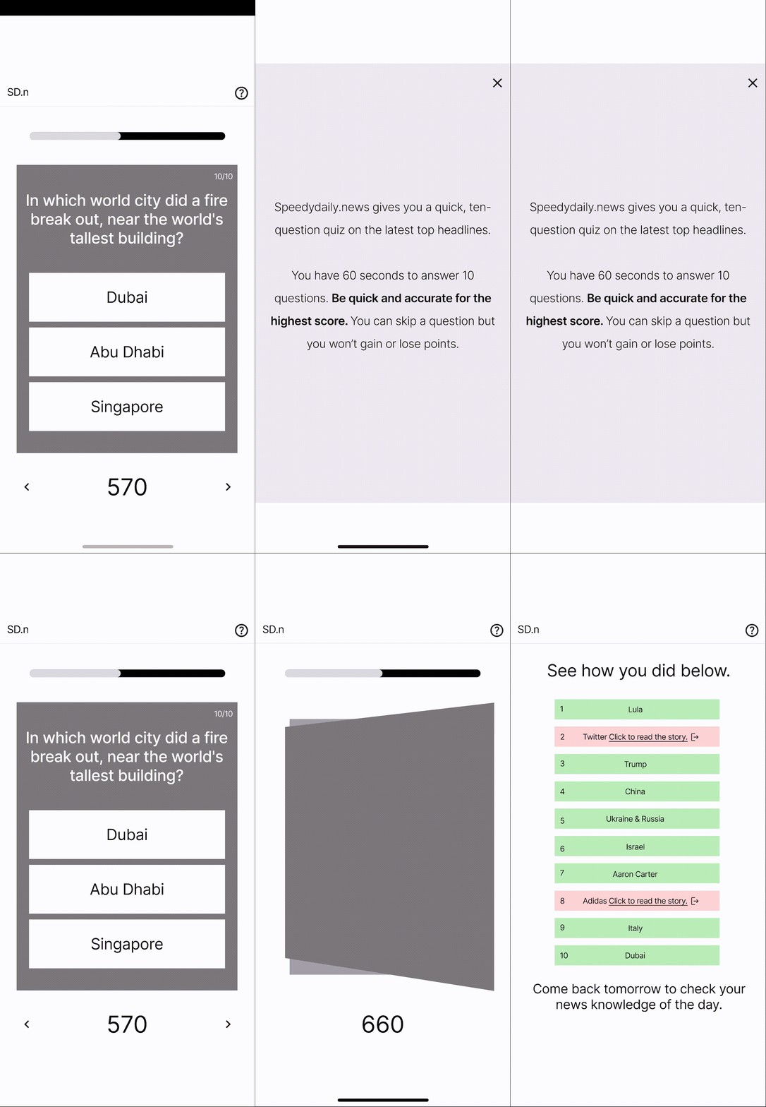
A screenshot of all main screens up to this point. Users enter the game immediately, flow through 10 questions, and end with an informative results page.


Usability Study
Research Questions
Using the low-fidelity prototype, I conducted a user study with the following questions:
Is the flow of Quizzy.News user-friendly? Why or why not?
What can we learn from the steps users take to complete the quiz?
Is 60 seconds enough time for the quiz game?
How long can the text (questions and answers) be before it is too time-consuming?
How many answers per question is ideal?
Parameters
Moderated usability study
1 round
5 participants
20-30 minutes
Users were asked to use a prototype and follow the prompt using the prototype.
Affinity Mapping
I wrote down the interview observations onto post-its and used affinity-mapping to determine the main themes of the study.
Observations
Themes
Refining the Design
Research Insights
Obvious Language. There should be careful wording or other helpful indicators of details like dates visible.
Prominent Location for Score. Users need scoring in an obvious, prominent location.
More Action at the End. Users desired more engagement at the end of the game such as learning more and sharing more.
Mockups
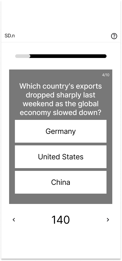
Based on the insights from the usability studies, I applied design changes like ensuring more specificity with quiz-question language.


Before Usability Study
After
Additional design changes included creating a more prominent score keeper and adding more engagement on the results page.


Before Usability Study
After

High-Fidelity Prototype
The high-fidelity prototype followed the same user flow as the low-fidelity prototype. The difference is it includes changes made after the usability study. View the Quizzy.News high-fidelity prototype.
Accessibility
Visibility. Colors and contrasts of colors were carefully selected so that people with visibility impairments can still read with great contrast. If color blind, icons were added to indicate if a selection was right or wrong.
Flow. Function of the site is very simplified offering best learnability to new users and efficiency enabling users to adapt to the site quickly.
Responsive Design
The designs for screen size variation include mobile, tablet, and desktop. I optimized the designs to fit specific user needs of each device and screen size.

Going Forward
What I Learned
Small flourishes, animations and movements can have a huge impact on the user experience. Since this is a game, every little nudge and jiggle adds to the exciting sensorial experience of engaging with it.
Next Steps
Write a brief on the entire project to pass to a developer.
Find a talented visual or motion designer to collaborate with to polish the game design.
Launch this into the real world. Dedicate 100 consecutive days to writing up quiz questions to see where this goes!